Live workshop
Motion for product teams
Springs, layout animation and reduced motion in two hours.
Thu, 14:00 UTC12 seats left
Every component is free, MIT licensed, reduced-motion safe and installable with one CLI command. Click any card for code, props and install instructions.
Spring release
A slow, drifting gradient that sits behind any headline.
Velora's signature drifting aurora gradient backdrop.
Now in public beta
Preview links for each branch, ready before the review starts.
Light beams flowing along curved paths behind content.
Hover the grid
An isometric grid whose cells light up in brand tints under the pointer.
Realtime sync
Canvas dot grid where drifting glows brighten dots and tint them toward the brand.
Flickering Grid
Grid of squares fading in and out on staggered timers.
Grid pattern · Dot pattern
SVG grid and dot backdrops with maskable depth.
A glowing lamp line that opens as the section scrolls in.
A glowing lamp-line header that expands into view.
Light Rays
God rays fanning down from the top of a section.
Meteors
Falling meteor streaks for dark hero and CTA sections.
A calm workspace for teams that ship.
Drifting brand-gradient blobs under a static film-grain overlay; wraps its content.
Particles
Drifting, twinkling particle field on a lightweight canvas.
Launch week · Day 3
Perspective grid scrolling forever toward the horizon.
Looking for devices…
Keep your phone nearby
Concentric rings pulsing outward — calm 'listening' backdrop.
Make a wish
A twinkling star field with brand-tinted streaks shooting across at random.
Into the vortex
Brand-tinted particles spiralling into the centre, leaving soft fading trails.
Make some waves
Blurred, translucent ribbons of brand colour flowing sideways on a canvas.
Ship beautiful pages
Brand gradient sweeping continuously through text.
Make it modern, animated, accessible
Cycles words with a springy blur-flip transition.
Scrambles through letters and resolves into the real text.
Blurs one phrase out as the next resolves in.
12,480+
Springs a number up when it enters the viewport.
Twinkling stars orbiting your headline.
Every component ships its own receipts.
Marker-pen sweep that draws in when the phrase scrolls into view.
Giant outlined word that draws in, then glows in brand colours under the pointer.
Word-by-word blur reveal on scroll.
A soft light sweep — great for AI loading states.
Build it faster., smoother., free.
Types, holds and deletes through a list of words.
Build faster, lighter, calmer
Swaps a single word on a quiet vertical roll.
Looping feed that springs each item in, newest on top.
Avatar row with springy name tooltips on hover.
Stacked initials avatars with a +N badge — zero images.
Maskable backdrops.
Streaks of light.
Feature bento with hover-reveal CTAs and rich backgrounds.
Link-card grid with a highlight that glides to whichever card you hover or focus.
“Swapped three separate animation libraries for Velora and the bundle got smaller.”
Dana Whitfield
“The size on every docs page is the reason we shipped it without a review meeting.”
Marco Elias
“Reduced-motion worked out of the box. That never happens.”
Priya Raman
Deck that shuffles the top card to the back on a timer.
Before/after wipe with a keyboard-accessible divider.
Overlay enters from the edge the cursor actually crossed.
macOS-style dock with cursor magnification.
Arrow keys move the card; Enter or Space brings it to the front.

Moraine Lake

Above the clouds

Northern lights

Red rock road
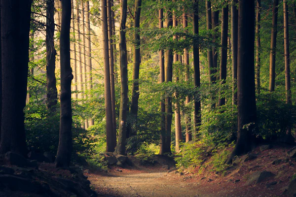
Forest light
Scattered photo cards you can fling around with inertia, tilt and bounds.
Card that reveals shuffling brand-tinted characters through a mask following the pointer.
Expands into a centred panel with shared-layout transitions.
Collapsible tree for documenting project structure.


Image grid where the hovered card stays sharp while the others blur and step back.
•••• •••• 4821
Member
Priya Raman
Valid thru
09/28
Sheet of light tracking the cursor, like a foil trading card.
Bento grid of image tiles that expand in place to reveal rich content.
Seamless scrolling loop — horizontal, vertical, hover-pause.
Items evenly distributed on rotating orbital rings.
The glow follows the pointer across the card surface.
A radial glow that follows the cursor across the card.
Springs, layout animation and reduced motion in two hours.
3D perspective tilt that tracks the cursor.
Launch week
Each branch gets its own URL, so reviewers click instead of cloning.
Colored card that drifts toward the pointer, with parallax content and grain.
Upload zone that lifts and glows while a file is over it.
Progress indicator for multi-step forms and checkouts.
Search field whose placeholder cycles while empty.
Native dialog whose panel springs in with a tilt over a blurred backdrop.
Five tiny CSS loading indicators — dots, pulse, orbit, bars and spinner.
Full-screen overlay that ticks through a list of steps, keeping the active one centred.
Screenshot panel that rotates flat as it scrolls into view.
Product studio
Fifteen launches this year, from analytics suites to brand systems. Scroll to browse the work.
Hero copy over three card rows that slide apart as a tilted block flattens.

A CSS-drawn laptop pins in place and opens its lid as the screenshot scales up.
Gallery columns drifting at different rates for depth.
Scroll this box
Paragraph 1. The bar above fills as you read, easing on a spring so it never jitters.
Paragraph 2. The bar above fills as you read, easing on a spring so it never jitters.
Paragraph 3. The bar above fills as you read, easing on a spring so it never jitters.
Paragraph 4. The bar above fills as you read, easing on a spring so it never jitters.
Paragraph 5. The bar above fills as you read, easing on a spring so it never jitters.
Paragraph 6. The bar above fills as you read, easing on a spring so it never jitters.
Paragraph 7. The bar above fills as you read, easing on a spring so it never jitters.
Paragraph 8. The bar above fills as you read, easing on a spring so it never jitters.
Paragraph 9. The bar above fills as you read, easing on a spring so it never jitters.
Paragraph 10. The bar above fills as you read, easing on a spring so it never jitters.
Paragraph 11. The bar above fills as you read, easing on a spring so it never jitters.
Paragraph 12. The bar above fills as you read, easing on a spring so it never jitters.
Gradient page-progress bar pinned to the top.
Marquee whose speed and direction follow your scrolling.
Add a component with one CLI command. The source lands in your repo.
Every class is yours to edit. Tokens come from your theme.
No runtime to configure. It is just a React component.
Copy scrolls past a pinned panel that swaps per section.
Two engineers, one spare room and a shared belief that UI libraries should ship as source you own.
The first public release. A thousand teams installed a component in the first month, and the issue tracker never slept again.
Theming, reduced-motion support and an accessibility audit of every component. Contributors from 40 countries.
Still small, still shipping. The next chapter is being written in the open.
Vertical timeline with sticky labels and a gradient beam that fills as you scroll.
The beam draws as you read.
Gradient line that draws itself down long-form content.
Draws an animated connection between any two elements.
The workhorse entrance — blur, fade and drift into view.
<BorderBeam />
A beam of light traveling around any border.
Bring the cursor near any edge and the border lights up where you are.
Learn moreBorder glow that follows the pointer around a card's edge as it comes near.
Perspective card that turns toward the pointer while its layers lift to different depths.
Card that tilts back as a glowing pin rises with a label chip and rippling rings.


A tilted 3D grid of images whose columns scroll up and down in an endless loop.
Snap-scrolling row of tall image cards that morph into a full modal story.

Full-bleed image slider with crossfade-zoom, autoplay, dots, arrows and swipe.
Q3 launch board
Move your mouse around the canvas to see a teammate's cursor.
Swaps the cursor for an arrow and a name tag that trail the pointer inside a region.

Circular magnifier that follows the pointer or arrow keys to zoom into an image.
Every component ships with reduced motion built in.
Draws an outline around a phrase on scroll, then glides a pointer icon to its corner.
Move your mouse around this box
The ring trails behind the dot and grows over links and buttons.
Dot-and-ring custom cursor; the ring trails on a spring and grows over links and buttons.
Your product here
Browser window frame for product screenshots.
import { useState } from "react"; // A counter that remembers its last valueexport function Counter({ start = 0 }: { start?: number }) { const [count, setCount] = useState(start); const label = `Clicked ${count} times`; return ( <button type="button" onClick={() => setCount(count + 1)}> {label} </button> );}Code panel with tabs, line numbers, highlighted lines and a copy button.
Your app here
iPhone frame with dynamic island — pure CSS.
$ npx shadcn@latest add velora/marquee
✔ Checking registry…
✔ Installing dependencies…
✔ Created components/velora/marquee.tsx
A terminal window that types its lines in view.




Social Proof3 components
Animated Testimonials
Crossfades portraits behind a rotating quote.
Logo Cloud
Customer logos muted until hovered, so they read as texture.
@danawhit
Tweet Card
Static social-proof card — props, not an API call.